Use the MINTO Pyramid to Shape Clear Thinking
Lead with the point. Back it up. Make it land.
You have a point to make. A strategy to pitch. A story to tell.
But if the structure isn’t clear, the idea gets lost.
Even great thinking can fall flat without a frame.
So how do you organise ideas so they actually land?
Use the MINTO Pyramid — a framework that builds your case from the top down.
What is the MINTO Pyramid?
The MINTO Pyramid Principle was developed by Barbara Minto at McKinsey in the 1970s.
She noticed consultants often wrote long, detailed reports—without ever stating their actual point.
Her solution? Flip the structure.
Lead with the answer. Then support it.
How it works:
Start at the top and work your way down:
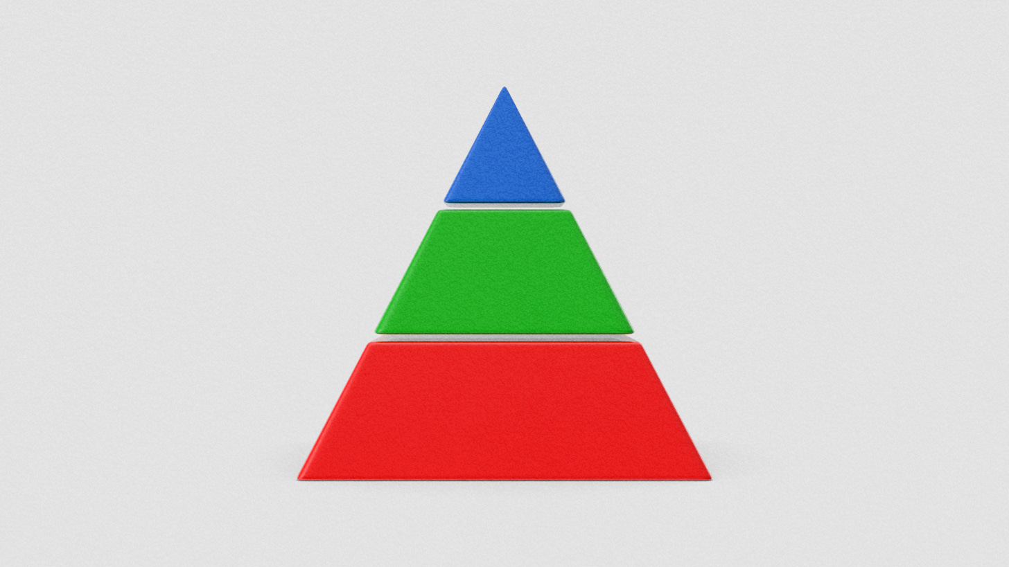
Conclusion — What’s your main message or recommendation?
Key Points — What are the top 2–4 reasons that support it?
Supporting Information — What data or insight backs each point?
It’s a pyramid. The base is wide—but the point is sharp.
1. Conclusion
Create your conclusion using the SCQA framework.
This helps you think clearly before briefing others:
Situation – What’s happening now?
Complication – What’s changed or become a problem?
Question – What decision needs to be made, and what are the options?
Answer – What do you recommend?
Example:
S: “The new site has launched and traffic is up…”
C: “…but conversions have stalled.”
Q: “Should we tweak the product offering or optimise the site’s user journey?”
A: “Let’s run a UX audit and improve the landing pages.”
Your conclusion becomes:
“The new site has launched and traffic is up, but conversions have stalled. Should we tweak the product offering or optimise the site’s user journey? Let’s run a UX audit and improve the landing pages.”
To keep things clear, you can remove the question and just deliver the recommendation:
“The new site has launched and traffic is up, but conversions have stalled. Let’s run a UX audit and improve the landing pages.”
2. Key Points
Next, add your main reasons supporting the conclusion:
Our main findings:
Mobile bounce rate is 30% higher than desktop
Heat-maps show users aren’t scrolling or engaging with content
Client feedback mentions confusion and unclear messaging on key sections
3. Supporting Information
Add any data or insight that supports those findings:
How did we arrive at this?
(Google Analytics: bounce rates by device)
(Hotjar heatmaps: scroll depth and CTA interaction)
(Client survey comments around navigation and layout)
(Screenshots of current mobile design with text-heavy headers)
Putting it together
The new site launched and traffic is up, but conversions have stalled. Let’s run a UX audit and improve the landing pages.
Our main findings:
Mobile bounce rate is 30% higher than desktop
Heat-maps show users aren’t scrolling or engaging with content
Client feedback mentions confusion and unclear messaging on key sections
How did we arrive at this?
(Google Analytics: bounce rates by device)
(Hotjar heatmaps: scroll depth and CTA interaction)
(Client survey comments around navigation and layout)
(Screenshots of current mobile design with text-heavy headers)
Or as a condensed message
“The new site launched and traffic is up, but conversions have stalled. Let’s run a UX audit and improve the landing pages. Mobile bounce rate is 30% higher than desktop, and client feedback mentions confusion and unclear messaging on key sections.”
The pyramid keeps things structured, sharp, and persuasive.
(And yep—this post followed the MINTO structure too.)


